Graph The graph feature is an intuitive tool that will help users create engaging graph visuals in the most convenient and creative way possible. You may select an existing template along with the other chart type examples upon creating a new project, or you can start with a blank diagram and choose your graph type symbol(s) under the graph menu toolbar.
Template This is where you select existing graph templates. It will automatically show up on the template and examples list when you create a blank diagram. You may also select a sample template under the graph menu toolbar.
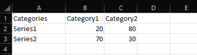
Import Data Here is where you can upload a CSV file to load graph data. You may locate this option under the graph menu on the toolbar. When it comes to CSV files, the number values should be placed along with the series. - A1 (column a, row 1) should always have a value.
- On the first row, the category names should start with B, C and so on.
- On the first column, the series name start on 2, 3, and so on.
- All data should be placed in accordance with the categories.
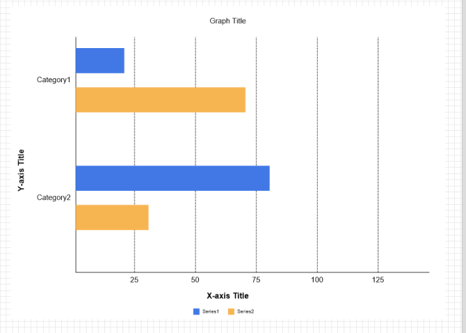
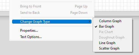
For additional reference on this aspect, see the table below: Assuming that the given format has been followed, this is how the chart should look like when importing the CSV: Once your data has been imported, it is automatically shown as a column graph. You can manually change the graph type by right clicking the graph itself, then selecting "Change Graph Type" from the list such as what is shown below:
Edit Data This is where you can enter and customize your current graph data. It can also be found along the other options on the graph menu toolbar. There are two aspects that you can customize: category and series. Under the category label, you can have a maximum of 12 custom labels. Under the series data, you may enter your data manually in accordance with the number of categories and input a list name per series. Changing the color that should represent the visuals of your data is also possible.
Title Click this option to add or edit the graph title. You may change the font, color, size, orientation, etc. upon toggling the title editor.
Key Toggle this option to show or hide the graph keys. The graph keys represent the name and the color you have chosen per series.
Value Toggle this option to show or hide the graph values. These are the numbers of the actual data that is represented by the visuals.
Axis Toggle this option to show or hide the x-axis and y-axis titles on your graph.
Switch Toggle this option to switch the placements of the row and the column of your graph. Altering the placements of the x and y axis will also change the visual representation of your graph (e.g. vertical bar graphs will appear horizontal when the switch option is toggled).
Font This option is similar to the title editor. But toggling this option will display the font properties for the selected texts within the entire chart.
Background Toggling this option changes your current graph’s background color. You may choose your own custom color under the fill color editor. Your background color may be transparent, solid, linear gradient, or radial gradient. The level of opacity for the background color may also be adjusted. |